 Post written by
.jpg)
It’s crazy to think we are approaching the end of a decade. The internet has changed a lot over the last 10 years.
We’ve seen a great deal of innovation when it comes to custom web design, as well as a great deal of new websites... According to Forbes, there are 1.5 billion websites in the world as of January 2019. While the exact number keeps changing every second, one thing we do know for sure is: among all of them, there will always be a selected group of websites that set the bar. Be it for their aesthetic, interactivity, navigation, imagery, or content, inspiring websites are trendsetters - they push the boundaries of what’s known to be possible.
Here’s our selection of website inspiration examples from 2019 and what makes them great.
No, you don’t necessarily need an animation for your website. But in our opinion, the quirky animations Toggl chose to feature on their homepage are a great example of how to showcase an innovative tech product or service. Toggl is a productivity and time tracking tool mostly used by busy professionals and businesses. Even though it’s a “serious” product aimed at people who need to get on top of their time management, Toggl presents their product in a fun way, which is great for creating a website that people will remember.
It’s not only about the images and animation, by the way. The website copy is smart and resonates well with their tech-savvy audience. It explains the product without being boring and the homepage is properly organised in short-paragraph texts and lean content.
Their website design is a great example of attention to detail. You have animations working aligned with page load, carefully chosen background colours to match and highlight the icons, and just the right amount of text. Everything in itself is attention-grabbing, but without being overwhelming.
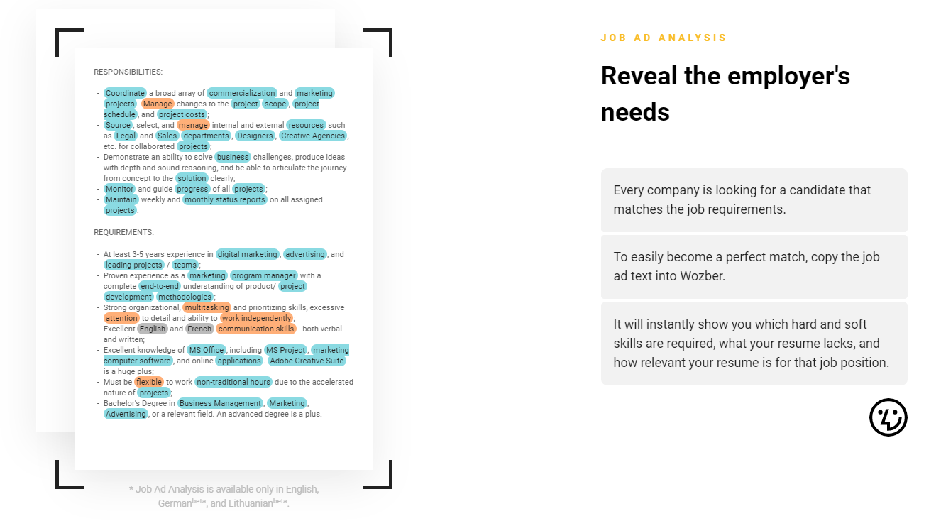
Wozber is a free resume builder for job seekers and as with any other online platform, you expect their homepage to be great. In fact, Wozber did a great job breaking down their product usability step by step. At first glance, the homepage enables the user to see what are the tool’s best features right away. It’s possible to see what sets them apart from other companies that do the same thing through their smart copy and visual elements highlighting specific product features.
In our opinion, any website that enables the user to quickly identify what the product does, the benefits and what action is needed, is a great example of using website design to communicate a powerful USP (Unique Selling Proposition). It’s not uncommon to see clunky websites with too much text and poor visuals out there, especially for tech products. If you have a website idea, here’s an expert tip:
When you are planning the website structure and content, start from the presumption that nobody understands what your product is about.
Even if you have a brick-and-mortar business and not a tech startup, there will always be a way to make your onsite text simpler. Have you heard about the Grunt Test? It’s the best way to test your website and ensure it’s clear enough for your target persona and the general audience. To know more about the Grunt Test, take a look at this blog post we wrote on the topic.
Coming back to Wozber, we would also point out the smart use of white space, which is something that not all websites nail. The dynamic banner CTA (Call-To-Action) on the bottom of the homepage is also great inspiration for experimenting with alternative conversion possibilities. Their product page design is simple, yet still shows the variety of resume templates for download. Overall their website design approach, consistently conveys the brand message around their software being user-friendly, providing all the outcomes needed for their target audience.
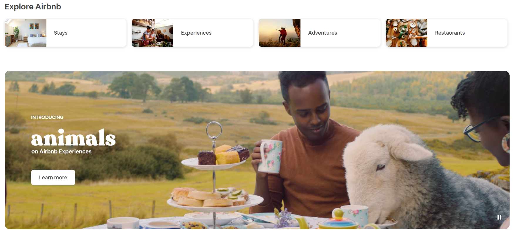
Airbnb is not only a business inspiration for entrepreneurs worldwide but also a great website example. Since the booking platform recently started to focus more on the experience side of travel rather than only on bookings, video now plays a big role on their website. Their homepage is a great combination of beautiful imagery, playful travel videos and discrete CTA’s that don’t disrupt the user experience.
Naturally, Airbnb takes very good care of what goes in their feed. Property pictures are carefully presented, making the website look like a beautiful Instagram feed. It’s interesting to see how brand identity consistency plays such a big role on a website too. Airbnb recently changed its brand design including logo, typography, and colour scheme. It doesn’t matter which website page you look at, you know you are on Airbnb’s website. This is super important for user experience and is a great lesson on what it takes to create a memorable brand.
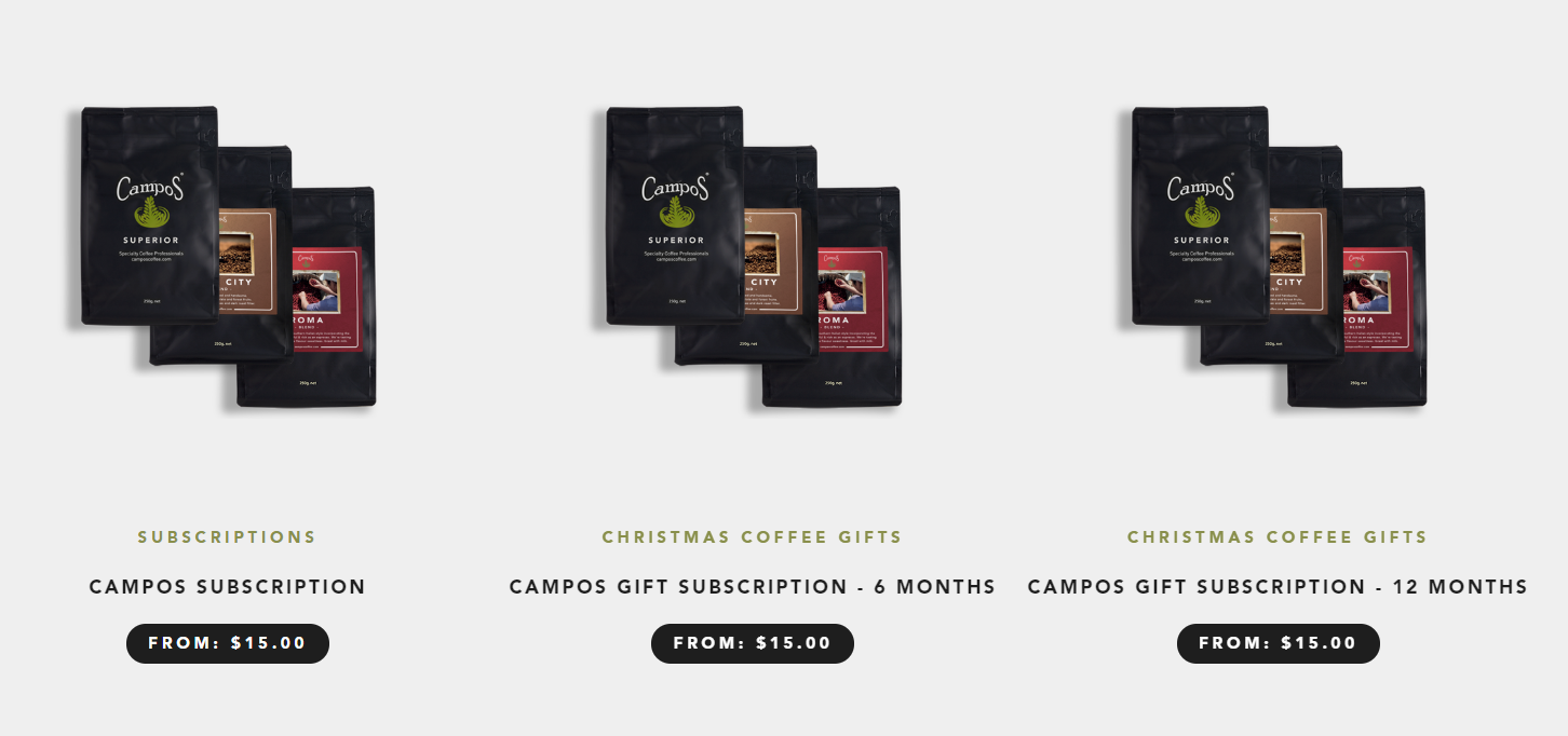
At this point, you’re probably thinking: “All right, these are all super innovative tech businesses, what about brick and mortar shops or local brands?”. Having a great website is not something exclusive to “cool tech startups”. Here’s an example of an Australian-based coffee brand for a great website design inspiration. Campos Coffee sells coffee online and also partners with local cafes in Australia as a supplier. They saw the need of having a website that communicates their product offering in a clear way.
Let’s start with their great navigation menu choice. Cafe Finder, Shop Coffee, Shop Equipment… These are easy-to-understand words which enable the user to find exactly what they want without having to click around too much. The dropdown menus are very intuitive and so are their product pages. There are no unnecessary information or visual elements that confuse the online user. Remember what we discussed about simplicity?
Try not to use jargon, complicated words or even full sentences in the navigation menu of your website, keep it simple to ensure a good user experience.
To avoid having too many images of the same style of products, since Campos is also an online store, they chose to work with transparent backgrounds. This gives a lighter feel to the “Shop coffee” page. Their website also includes useful barista guides and a great blog featuring their partners, volunteer work and also real customers, which is great for increasing proximity with the website visitor.
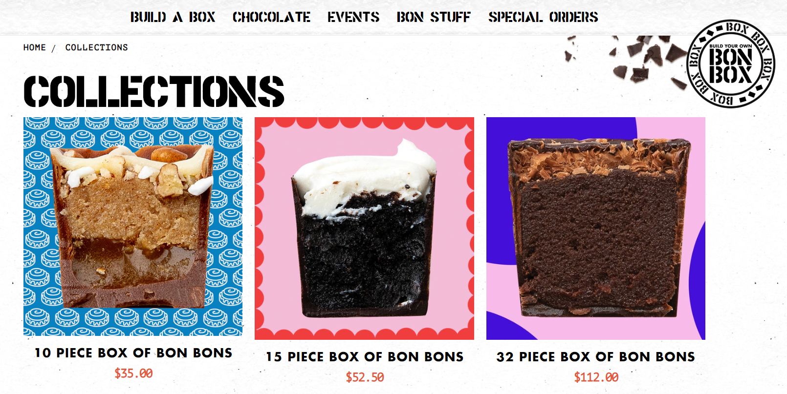
And since we are talking about local shops and brick and mortar businesses, here’s another example of how a local shop can increase their brand visibility by having a great website. Bon Bon Bon is an artisan chocolate company based in Detroit, in the US. They started as a brick and mortar brand and expanded their business by increasing their online presence through the website.
It’s definitely not your usual food shop website. They make use of strong colours, funny backgrounds for product pictures and a far from boring website copy to highlight product features. They offer customised chocolate boxes and just launched a service to enable their customers to order a box online.
We loved the funny category names, Instagram-perfect blog pictures, and the comic book style graphics. Naturally, this needs to match the brand identity. Just by looking at their blog, it’s clear that they try to earn customer’s hearts with an unconventional writing style. Bon Bon Bon is a fun brand and their website is the perfect representation of their creativity and spirit. One great way of assessing the quality of your website is asking yourself: "Does it reflect the personality of my brand?"
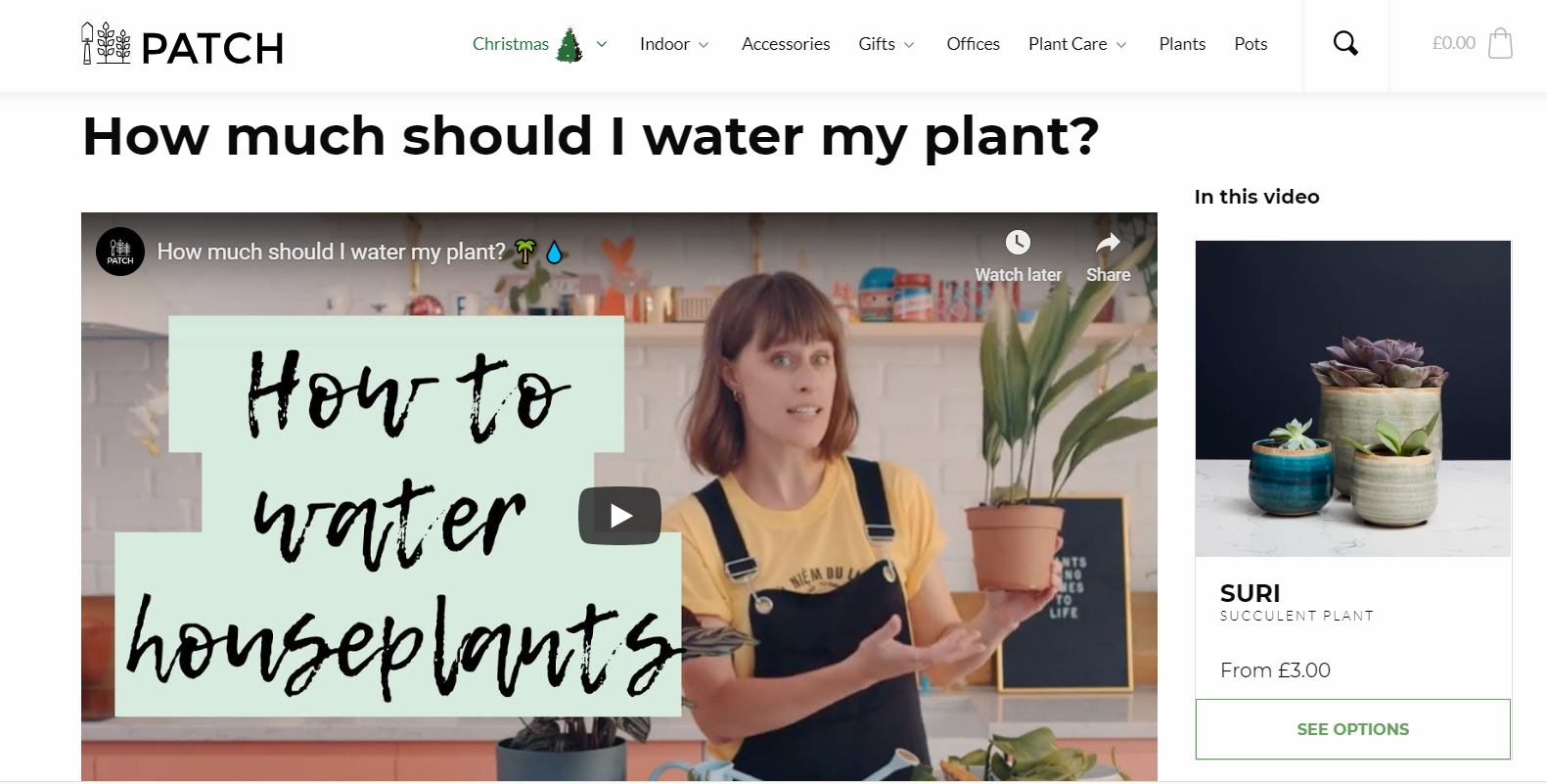
Patchplants is a perfect example of good content marketing aligned with great website design. They sell indoor and outdoor plants online and have a beautiful website with minimalist plant pictures and a hub of resources for their customers.
If you’ve ever bought a plant for yourself or as a gift, you probably wondered a few things about plant care. Patchplants thought about that and decided to choose video as their main education platform. In the section “Plant care”, you’ll find a selection of videos addressing topical questions about plants next to a cute little product picture you’ll most likely click on after the video finishes. It’s a great way of adding value to the sale by providing education to the user.
Interestingly, some of their dropdown menus are divided into three sections, giving space for on-site optimisation in such a way so that user experience is not interrupted. The colour scheme is also a good choice, with a nice mix of green, white and black all over the website. The product images are carefully curated to match like in an Instagram feed style and the website is overall very intuitive.
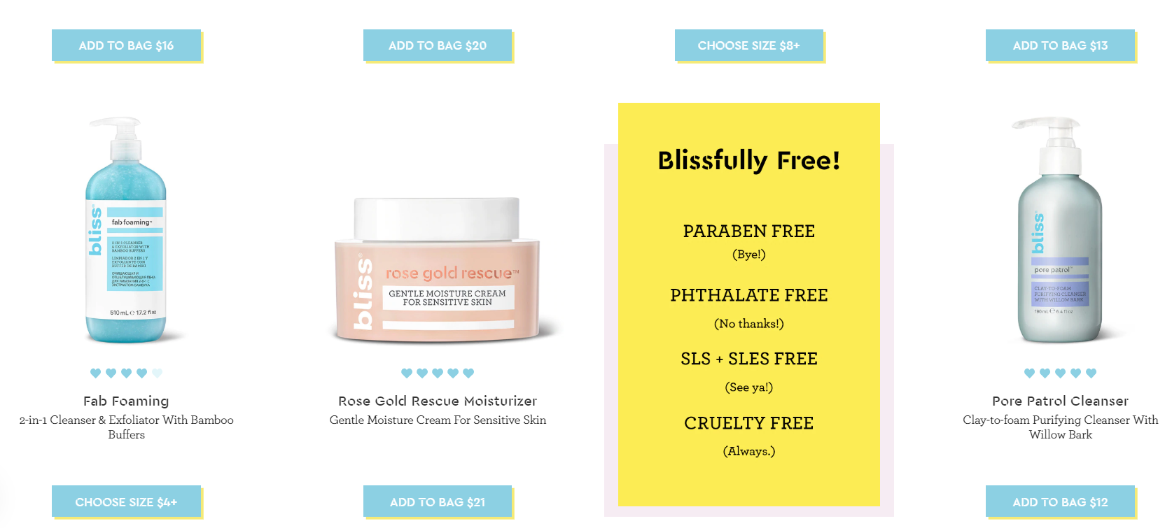
Bliss is another great eCommerce website that sets the example for brands who want to innovate and puts themselves ahead of the competition. Just by looking at their website, it’s clear who their target persona is - young women who are looking for eco-friendly products. The use of fonts, colours, icons and also the page content all resonate very well with their ideal customer. The website looks like a fun magazine rather than a cosmetics brand. (Want a site like this for yourself? Learn more about our ecommerce website design service.)
Companies who provide education to the customers before and during the sales process tend to have a better conversion rate. Bliss does this by including boxes with information about their products in between the product images, as per above image. It's a nice visual touch and interrupts the user experience positively. Bliss also has an ingredients glossary available on the website so that the user can learn more about some of the ingredients used in the cosmetics.
This site has a fresh and engaging feel. Considering that the brand promises that inner happiness leads to outward beauty, it’s not hard to understand their website design choices.
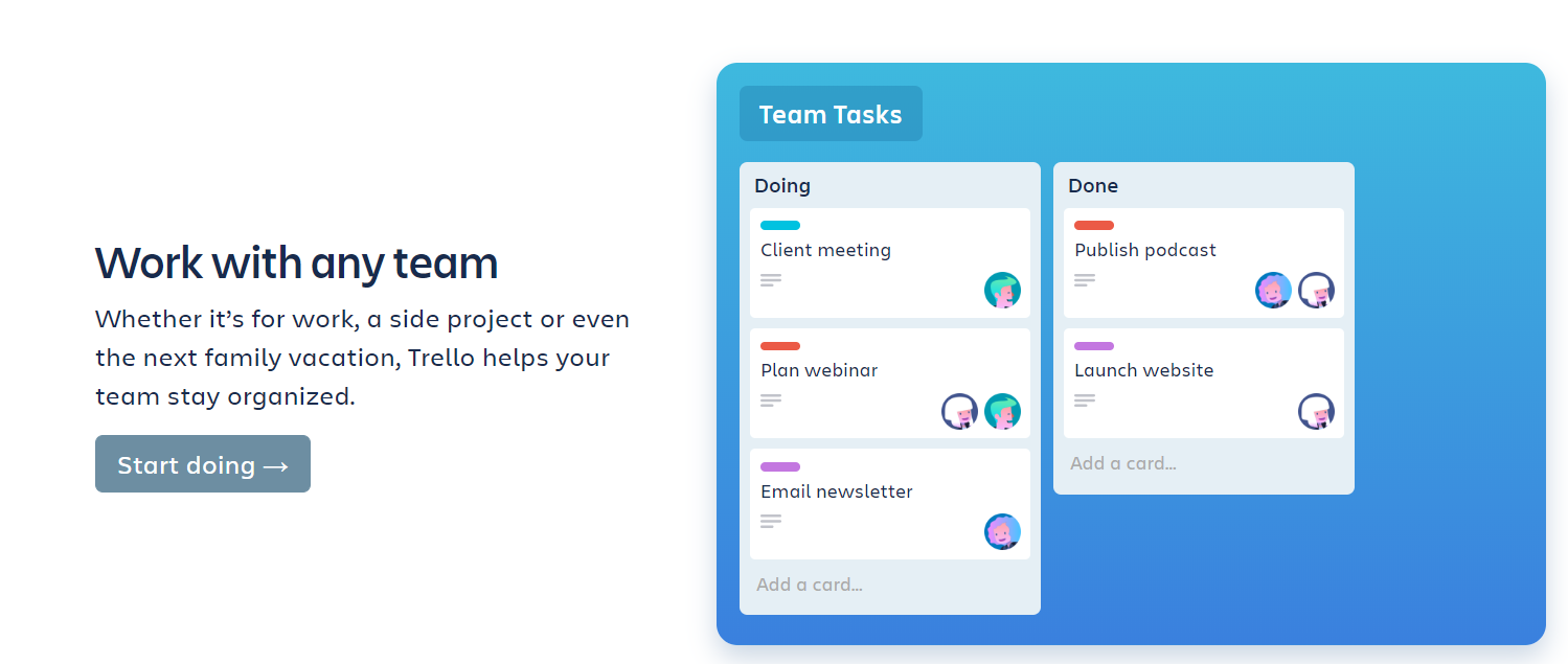
Coming back to tech products, Trello is a project management tool used by small to medium size companies. The platform allows a team to organise, prioritise, and assign tasks. They make use of 3D graphics and icons - one of the latest trends in website design. We must say it goes well with their innovative approach.
If a first time user goes to their homepage (or someone who doesn’t have much experience with project management tools in general), they can clearly see how the product works just by looking at the images. Visuals are a great tool for Saas companies to enable the audience to understand what their product is about. Online users nowadays don’t tolerate tech jargon anymore - the era of websites with too much text in their product description is gone. The best way to explain a complex product or service is to make user of beautiful visuals, videos or animations.
The company chose to work with a footer menu, instead of top page navigation menu. It’s a very interesting approach as it gives the homepage a user-friendly flow in a way that makes the user focus on what’s important: the platform itself. The language used in the buttons and on-site content is concise and clear. The homepage doesn’t even have a section called “Product features”, all the details about the product can be visualised directly through the homepage - no need to click around too much.
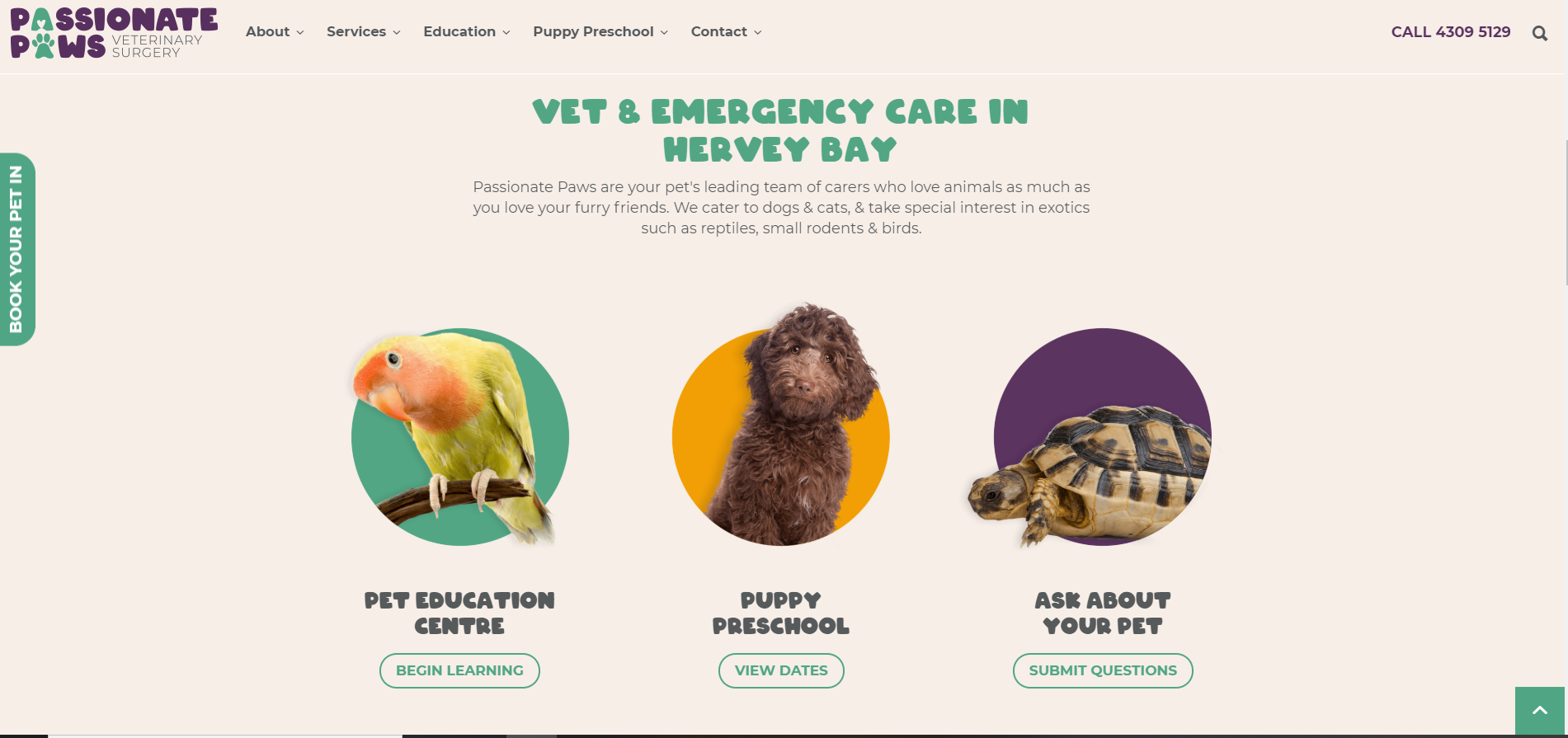
It’s great to see companies who put customer experience at the forefront of all that they do and to see this reflected through to their website. A company who doesn’t put themselves in their customer's shoes will usually have a poor business and this is also a critical principal when it comes to having a great website design. Passionate Paws is a vet clinic and puppy school based in Queensland. When they approached us for new website, they knew exactly what mattered most for their customers: having a stress-free experience with their pets during the first visit to a veterinarian.
Throughout the website design project, it was clear that their homepage had to be focused on their caring and stress free approach. Pet owners want to be reassured that their pets are in good hands. This is why we included extensive content on their “fear-free approach” and the highly trained staff at Passionate Paws. We knew the importance of talking about their team members to increase brand trust, so we put together a page dedicated to the vet nurses’s bios (never under estimate the importance of the about page).
The colour scheme and icons used on the website are aligned with the company’s branding that we first developed. Passionate Paws’s brand identity is friendly and warm, which also explains our design choices when it comes to the imagery and banner backgrounds (take a look at the Education section, we love that cute turtle!).
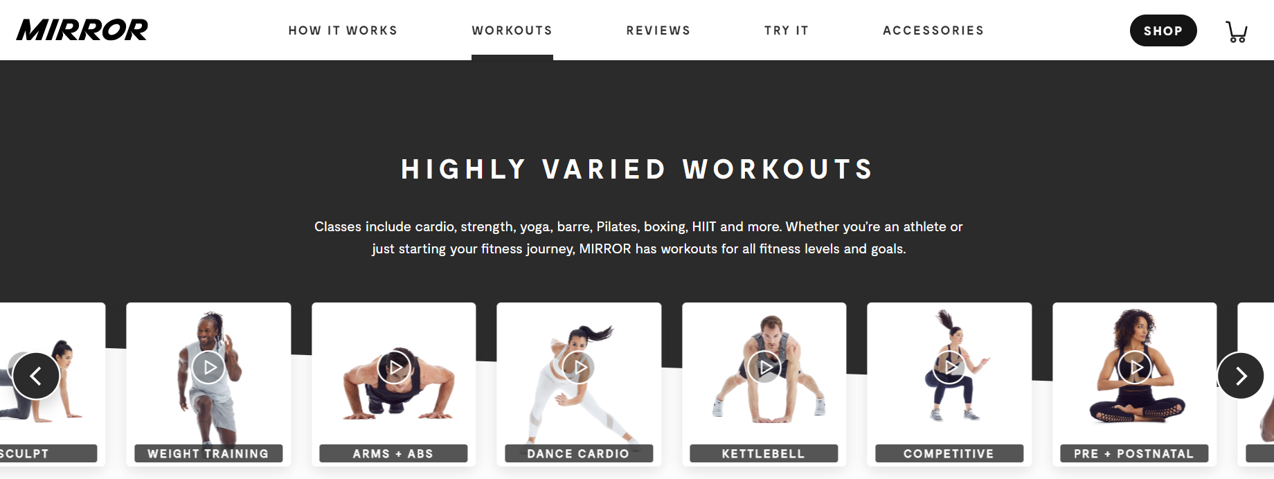
Another example of how a great website can be simple and straight to the point is Mirror. To start with, they created a product that didn’t exist in the marketplace and a very cool one to boot. Mirror revolutionised the fitness industry by creating a device that looks like just another full-length mirror when offline. After you turn it on, it literally becomes a gym. Mirror is an interactive display with cameras and speakers so that users can work out real time with other people and a trainer.
It’s fairly difficult to explain a product like Mirror's to the general audience but their user-friendly website design makes the concept quite easy to grasp, thanks to images demonstrating how real people would use the product. Explaining a product through the use of clever imagery usually works better than text, especially for new products in the market. The workouts section has a great dynamic gallery of short videos which is great for showing product variety without being too overwhelming.
Mirror is a high-class niche product inside of the fitness industry, so it's more than natural that their website design choices reflected this. There’s no section of the website with too many elements in the same space. The use of white space, black and white, cropped minimalist images, simple icons, and very discreet buttons matches well with the brand message.
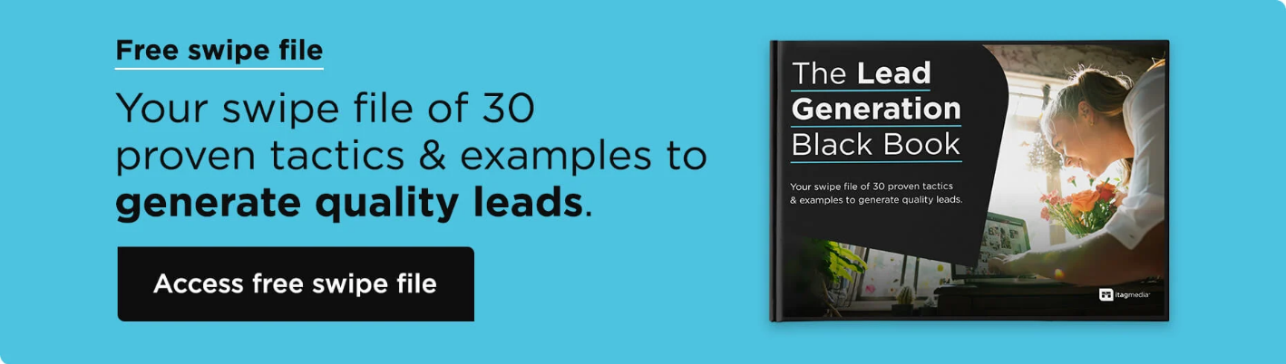
We hope you learned something new with our 10 examples of incredible website designs. It’s good to remember that these businesses are in different industries, which shows that literally every company out there has the potential to have a great website to attract new customers or simply increase brand presence online. If you already have a great website but you're not getting leads, then you will definitely want to check out our free e-book "The Lead Generation Black Book".
If you would like to have a chat about your current website or need assistance creating a new website for your business, let's get talking. We’re passionate about making your brand identity and website design unique and memorable.