 Post written by
.jpg)

There are over 1.5 billion* websites on the world wide web today. Just think about this number for a second: for almost every topic, business, or idea, there’s a website out there.
In fact, it’s quite easy to create a website nowadays. Website builders such as Squarespace or Wix allow you to have a website with a few clicks only. But how easy is it to truly create a high-quality website that delivers a good ROI for your business? What makes a good website in the first place?
Here at Itag Media, we believe a good website is your best ally to achieve your business goals. When we say "good", we mean a high-quality custom website backed with a good web strategy designed to bring leads to your business, sales to your e-commerce store, support to your clients or more visibility to your brand.
In this blog post, we will talk about the characteristics and features a good business website must-have to help you launch one successfully. We’ll focus on business websites, however, you can also apply the tips below to your personal blog.
A great website has a powerful domain name. In most cases, your domain name is simply the name of your business followed by the most appropriate extension for your country and industry. For Australian websites, we typically have “.com.au”. For educational websites, we may have “.edu”, for not-for-profits, “.org”, and so on. We do though recommend, for brand protection, to always try and secure the .com, .net, .net.au and .com.au domains for your business.
Why is it important to set up a custom domain if you can easily create another “companywebsite.wordpress.com” and host it with a free service? The reason is simple: It's important to have your exclusive address on the internet, so that you keep your brand front and centre to all site users. You don’t want your customers to think your website looks like a personal blog. A custom domain will allow your website to have an undiluted image, which in turn will make your website far more memorable and professional-looking.
Usually, the navigation menu is one of the first elements of a website. This is where the user can find the main information about your company. A menu should be simple and adopt best practice. When we say simple, we mean “grunt-test-style” simple, or “so simple that a caveman would understand it at first glance”. If you are not familiar with the Grunt Test, take a look at this blog post we wrote on the topic.
A simple menu 'aka' website structure is divided into sections with words that everybody can understand. It's okay to be a little creative but be very careful as people are very familiar with common navigation words eg: About, Services, Contact etc. Your menu needs to be tied to the hierarchy of pages on your website and help guide the end user to the things that matter most to them. Think about the diagram below: At the very top, you will have the most important pages of a website. Inside each one of them, you will have related sub-pages. Remember that you don’t want your navigation to be super complex. Here's a good example of simple navigation for a restaurant website:
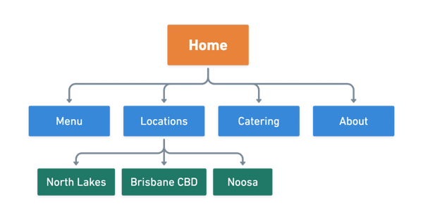 Also, it's usually a good idea not to go to more than two sub-pages deep on your navigation structure. This will help with usability and your sites ability to be easily crawled by search engines. There are exceptions to this rule but the key is, be aware of why you are doing something in a particular way on your site and have it backed up with your goals and end user needs.
No, you don’t need to “fill in the white space” with any stock images you find just because this is what your competitors are doing. Sometimes, it's better to add a background colour to a banner, or just a box with text, rather than images that don't add any value. It's also great to use videos, graphics, animations or professional photos of your business, team or products (ideal and we highly recommend this), as long as this choice makes sense for your business.
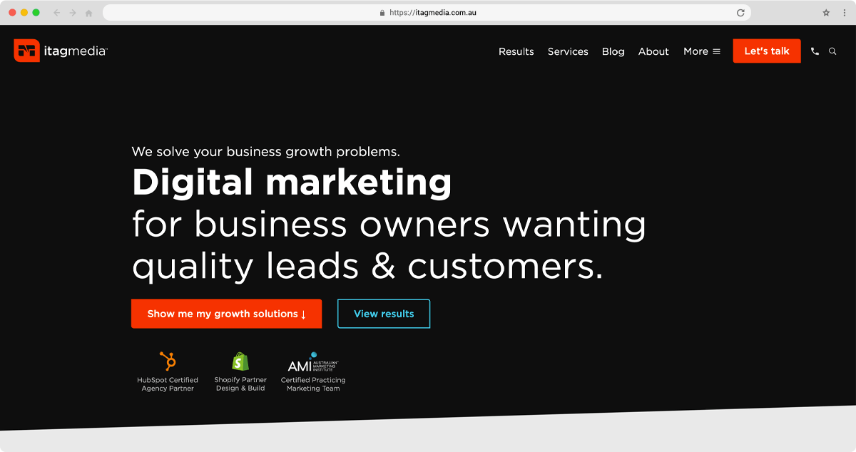
Whatever makes your website design appealing to your target audience without disrupting the user experience in a negative way, is a good choice. No matter what your design ends up looking like, it's always good to be testing and reviewing, as your website should evolve overtime. Gone are the days of getting your website re-done every 3 or 5 years, as today's technology allows for a much more fluid and rapid approach. For our website, we chose to keep the banner background simple and also included animated text that is personalised based on a users stage in the buying cycle. Overall, this design decision has been made for strategic and brand consistency reasons.
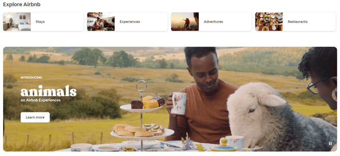
In our case, the most important message is text, so we decided to focus on the copy. Airbnb, on the other hand, makes use of video for their banner backgrounds as a way to enhance their user experience.
According to Marketing guru Neil Patel, “optimising the copy on your website is at least as important as optimising the design, especially if the primary goal of that site is to convert visitors. If you really want to gain new customers, you need to optimise the text on your site to instil trust in visitors and make them want to purchase from you”. Your on-site text must be:
A good website design encourages the visitors to engage with it. It also holds their attention through every page, so that they feel compelled to purchase/get in touch with you.
Typically a website would have smart CTA (call to action) buttons which are in line with the copy and the action that we want the user to take. A conversion is probably one of your website’s ultimate goals. Naturally, there’s a fine line between interaction and “being annoying”, so the interactive elements should not disrupt the user experience in a negative way. Here’s a few good examples of interactive elements which lead to conversions or encourage other important actions in a website:
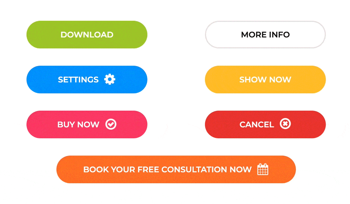
A great button / CTA will clearly communicate what will happen when you click the button and don't be afraid to have longer text eg: Download Your Lead Generation Ebook Now, Book Your Free Marketing Consultation Now. As you can see we are not just saying download like the above examples, we are clearly setting the expectation of what they are getting, giving the user more reasons to click. This approach alone is proven to help you increase your onsite website conversions dramatically.
Ideally, you should anticipate what your visitors are thinking. Yes, we know, this might look like an impossible task. However, if you start by researching your target persona and identifying their pain points, you will have a better idea about their priorities and what gets their attention on a website.
Intuitive design is all about keeping things simple so that the users know exactly how to find what they need, and know exactly what to do with all the website elements. Of course, your website has to be beautiful - but that’s not all. Scrolling text, flash intros, and animations won’t have a big impact if they don’t have a reason to be there. When in doubt, keep it simple.
Not all your website visitors are there to “shop around”. Some people may need to access only an address or your customer support number. This type of information needs to be placed in an easily accessible area of your website. Remember: A visitor who is not able to locate some needed information on your website is a frustrated visitor - they wonʼt stay on your site very long and most likely won’t return later.
A website should automatically scale its content and elements to match the screen size on which it is viewed. Just keep in mind that your target audience is not always using a laptop. The worldwide increase in mobile phone usage is not just a trend - it’s the beginning of a new era in the technology world. Businesses need to adapt to this, hence the importance of a mobile-friendly website.
Your website users should not have any trouble reading the content and accessing information on a smaller screen. The average time spent by users on your website is an important factor used by search engines like Google to determine whether your website is good or not. In summary, having a mobile-friendly website is directly related to your website rankings, which, as a consequence, has a huge impact on your website traffic and sales/conversions.
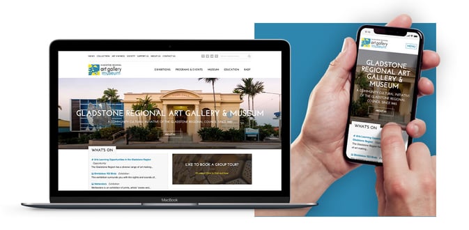
The image above shows the web design project we developed for one of our clients, Gladstone Regional Art Gallery & Museum (GRAGM). As you can see, we made sure the website was responsive across all platforms. Read more about this project here.
Your website should be a direct reflection of your business and your brand. The idea is that your visitor makes an immediate visual connection between your logo, your website design, and your brand offline - be it your brick-and-mortar location, your TV ad, or any sort of print advertisement you created for your company. A website that does this not only contributes to the memorability of your branding, but adds a level of credibility and helps strengthen the brand of your overall business. This basically means, that if your spending money on advertising everything should work together as a family, which will allow your message / brand to have a much greater impact and ROI.
Your website is your business card. It’s what everyone – your partners and shareholders, investors, customers, friends and family – sees when they think of doing business with you. If your website is looking sharp, you make sure all these people view you as a professional and trustworthy partner.
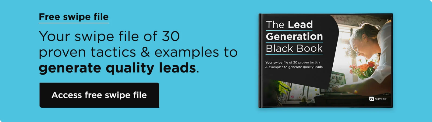
Here at Itag Media, we create a web strategy that is designed to achieve your end goals and to appeal to your target audience, resulting in a website that helps you attract and convert customers. Not happy with the design of your current website? Looking into creating a brand new memorable website for your brand? Get in touch with our team at any time. Outside of this, if you already have a website but want it to work better, then download our free swipe file - The Lead Generation Black Book.
*source: Internet Live Stats