 Post written by
.jpg)

How your visitors perceive and interact with your website really can make or break you. A good website is beneficial to the end-users but also serves search engines as well which in return can generate potential leads and conversion for many years to come. In this blog post, we’ll talk about the crucial elements of web design and their impact on performance.
There will always be new trends emerging in website design styles and elements each year. The problem is that not all these trends apply to your business. Good website design should help support your business goals and communicate your brand message in an effective way. Certain elements or trends, when incorporated cleverly, can help tell the story of your company and explain what it’s all about. Your website features should always have a clear purpose or goals and not just be there for the sake of it. No mater if your thinking of how best to design your website or your going to work with a web agency, the elements covered below will ensure your website meets your business goals.
We put together a list of 9 essential elements of modern web design. This will help you launch your website successfully. As you will see, there’s nothing “fancy” here. This is because great websites don’t benefit much from an overload of visual elements. Nowadays, having a simple, clean, minimal, and professional-looking design is what can make your website more effective and provide a better user experience.
Key topics covered in our website design essential list:
Easy site navigation is one of the most significant elements of website design. To help you understand how important this is, think about your own experience when browsing websites on the internet. Have you come across websites where you simply didn’t find what you were looking for? Confusing information on the navigation bar or too many navigation items can leave a user extremely frustrated.
Lean and simple websites are much better to navigate. We put together a quick list for “do’s” and “don'ts” when it comes to website navigation.
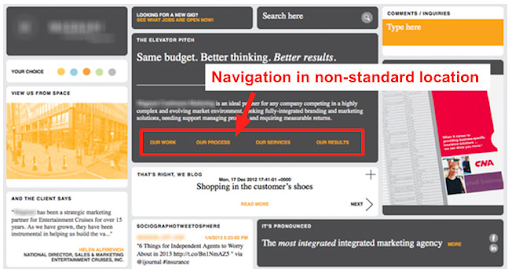
Having great services on offer or an amazing portfolio is of no use if people have a hard time finding what they need on your website. Potential customers are more likely to stay if your website is easy to navigate.
A blog has a different layout than an eCommerce website. Designing a website that focuses on texts as its primary form of content is completely different than creating an online shop, which typically focuses on product images. The key is you need to design your website according to its purpose and user expectations.
The simpler the structure of the site, the easier it is for users to navigate. Each section needs to tell a story; it needs a reason and a final outcome for the user. The layout should help the content to highlight what are the most important pieces in that story. Think about the most simple layout you can imagine for a simple purpose, and start adding components that are necessary.
This tip may be against your natural instinct, but keep images, flash, and java scripts to a minimum. While it is an excellent idea to add visual appeal to your website, you don’t want to slow down the viewing process with unnecessary elements. If a visitor has a slow connection, or if your heavy graphic website design is taking too long to load, then you’ll risk losing your audience.
If your brand was a person, what would they look like? Fun, young and energetic, or serious, professional and conservative? Your brand personality should be appealing to your target audience, after all. In marketing, branding is more than a name, design or slogan. It's also about getting your prospects to see you as the sole provider of a solution to their problem or need.
Start by defining your core message - who you want to be in the first place, what your brand stands for and how your product or service can solve the problems or needs of your consumer. Everything else, from your corporate logo to the images you use in your website, serves the purpose of supporting this message.
It’s important to keep brand consistency on and offline. If you happen to work with a print advertisement, it’s important to make sure your design assets are aligned with your online presence. You want people to look at your Instagram feed and know that it belongs to you before even looking at your logo, just by the “look and feel of your posts. The same goes for the other channels. If you want to create a long-lasting brand association and relationship with your customers, branding is where you should start from.
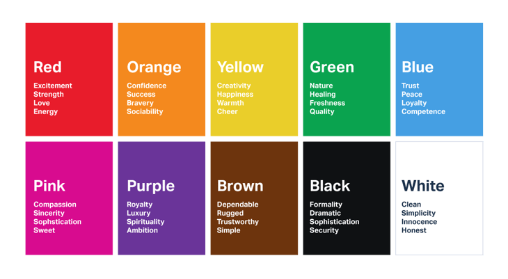
Do you feel serenely calm when surrounded by green fields and blue skies? Have you ever asked what does the colour red represent and why you feel slightly alarmed when staring at a red stop sign? Colour psychology study’s hues as a determinant of human behaviour, and it is used by brands to evoke different reactions.
Ideally, you would have decided on the corporate colours within the branding concept creation. Building a successful website also relies on choosing the right combination of colours through colour theory. Ideas are developed through colours - they express messages, create certain emotions, and spark interests.
When choosing your site’s colour scheme, do not just pick the ones that you like, choose those that can strengthen both your business, brand, and website. Colours that look pleasing individually may not work well together. Learn how colours actually work together and what they symbolize, as well as how they are emotionally and internally evaluated.
You can come up with the most compelling content in the world, but if it is too difficult to read, you will lose your readers. Arial, Montserrat, Sans-serifs or Times New Roman are a few examples of good font choices concerning readability online. If you really want to incorporate fancy typography to make an impact, consider using it for your headings.
Considering font size is also vital. Although we can increase the size of fonts on our devices, there are still some users who are not aware of how to do this. Back in the days, the standard font size was 12pt, but nowadays more and more websites are using the 16pt range or even bigger because of how well it works on mobiles, tablets, and computers.
Quality images are more than just a nice element to add to your website. You may think that the only purpose they serve is to make your site look good, but they do so much more than that.
When used correctly, they can help drive traffic to your site, encourage sharing on social media platforms, and eventually, they can help drive the goals of your business like conversion. They also work well with modern web design and they help get you the results you want.
In today’s online world where we are surrounded by so much information, it is imperative for your layout to be clear. Whether your website is e-commerce, a business website or a blog, it should have an easy-to-understand and readable design.
White spaces or negative spaces are the parts of your page that are left unmarked or empty. It creates balance, harmony, and it is helpful in branding design. It is also useful at directing your readers from one element of your page to another. Furthermore, it is an element of modern web design that can make any site look simple, clean, and uncluttered, and you will be able to deliver information that your audience will appreciate, understand, and enjoy.
Responsive web design is a big thing right now. It can help solve many issues of your site, make it mobile-friendly, improve how it looks on all types of devices, and prolong the time your visitors spend on your website.
It is essential for your website to be viewable across numerous devices since you never know what kind of device visitors will use to visit your site. Mobile browsing has already overtaken the use of desktop when browsing the web. Furthermore, responsive web design presents several benefits for your site including flexibility, improved UX, cost-effectiveness, ease of management, and SEO gains.
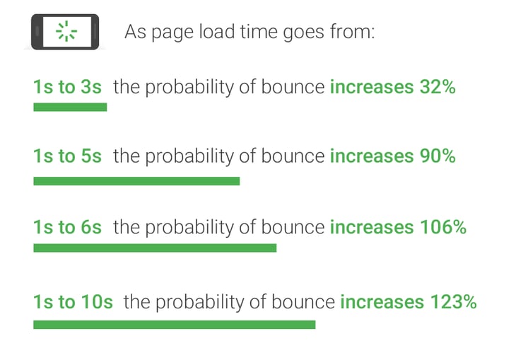
Nowadays, buyers are impatient and they will leave your website if they have to wait more than five seconds for it to load. No matter what your business’ niche or industry is, you want to provide your customers with a positive user experience. As the behaviours of customers evolve continuously, the speed of your website is something you should never overlook.
You now also have to consider mobile page speeds as a key factor to keeping people on your website and getting your visitors to convert.
“As page load time goes from one second to seven seconds, the probability of a mobile site visitor bouncing increases 113%. Similarly, as the number of elements—text, titles, images—on a page goes from 400 to 6,000, the probability of conversion drops 95%” ~ Think With Google
Think with Google
Source: Google/SOASTA Research, 2017.
The above research from Google, clearly shows why a fast loading website plays an important role in its usability, conversion rates and SEO ‘aka’ rankings in search results. Even if your site has an exceptionally modern web design, if it loads slowly, your visitors are more likely to lose interest and force them to check your competition instead. Ensuring that your site is fast and loads easily can help potential clients to interact with it and at the same time increase your search engine visibility.
Tip: What is bounce rate: A high bounce basically means - a site visitor hits your first web page and doesn't explore further. They’re like a tennis ball hitting the intended destination but quickly leaving.
Google goes on to say that “No matter what, faster is better and less is more”. This does not mean you have to have a boring site that does not have great design, as this will affect the user experience so you need to balance this out. On mobile this idea of less is more is critical and you can definitely lean out the graphics, since there is much less screen space and the mobile users needs are very different.
If the website design agency you engage understands the importance of a high performing website that Google and users will love, then they will ensure your website images are compressed, servers are fast, and the latest technology is used to ensure your site is fast on both desktop and mobile devices.
We hope this article has given you some ideas on how you can make sure your website is ready to convey your brand message and attract customers. It might seem like a huge amount to think about but a great website always has a good amount of planning and strategy behind it, along with all the elements outlined above.
The main thing is, use the above list as a guide to check that the web design company you engage does the essentials. Most professional website design agencies will have a streamlined process that ensures all these critical web design elements are implemented, so you won’t have to stress about a thing.
It is important for the long term health of your website and brand that you nail these 9 essentials - Easy Navigation, Overall website layout and appearance, Branding, Colour Scheme, Typography, Images & Video, White Space, Responsiveness, & Speed. If you apply these important principles it will help ensure your website becomes a marketing tool rather than an expense to your business.
Finally, we would love to help you take your online marketing to the next level, so if you have any questions or are interested in partnering get in touch today.