 Post written by

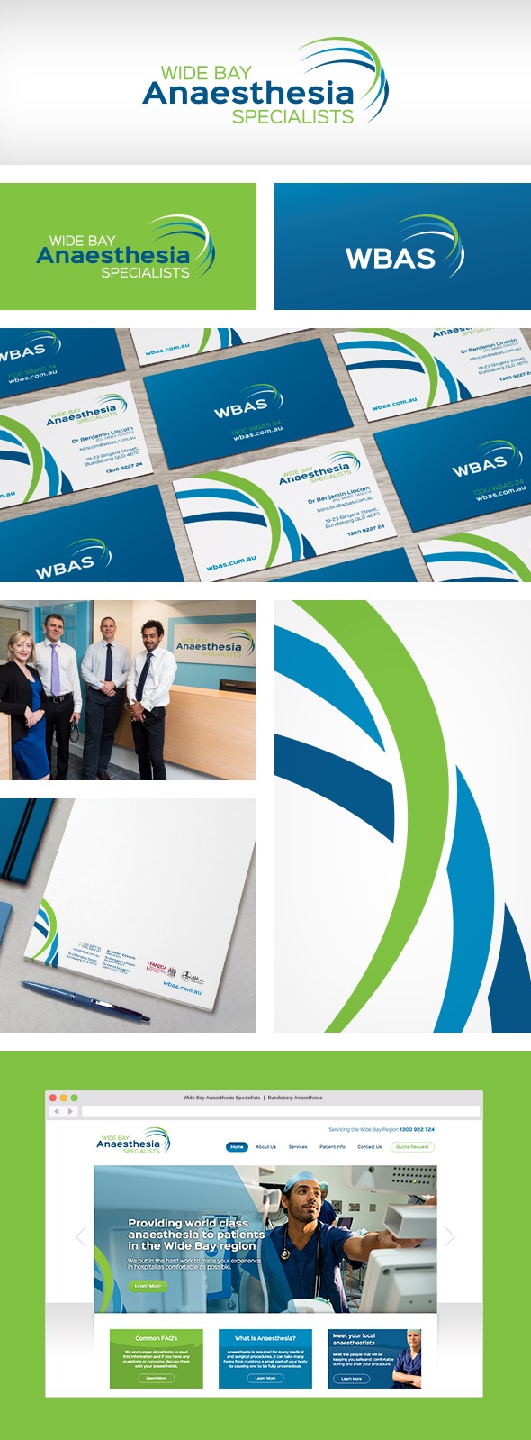
Wide Bay Anaesthesia Specialists came to us needing brand creation services and corporate stationery, as well as a website for their soon-to-be-opened anaesthesia practice. We worked closely with their team to create a brand identity that would position them as the leading experts for anaesthesia in the region.
Their logo features fresh tones of blue and green, along with a unique and clean font. As their business name is quite long, the logo package also sports an abbreviated version for use when a smaller logo is needed.
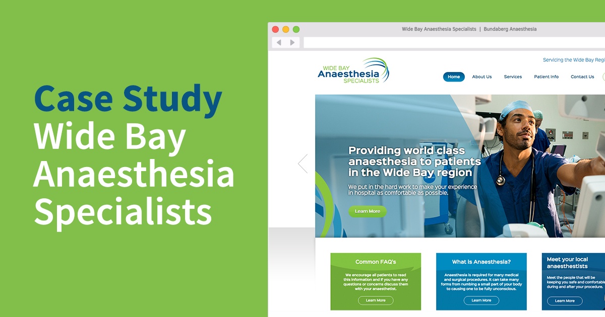
The client wanted the website to be clean and professional, without the ‘hospital feel’ that many medical sites have. To add a personal feel to the website, we recommended that the client commission a local photographer to provide us with a collection of friendly photography for use throughout the site. By combining their professional photos with great colours and consistent typography from their brand identity, we were able to create a truly unique and user-friendly website.
Get in touch to find out how we can deliver your message! Get in touch

Get in touch to find out how we can deliver your message! Get in touch